

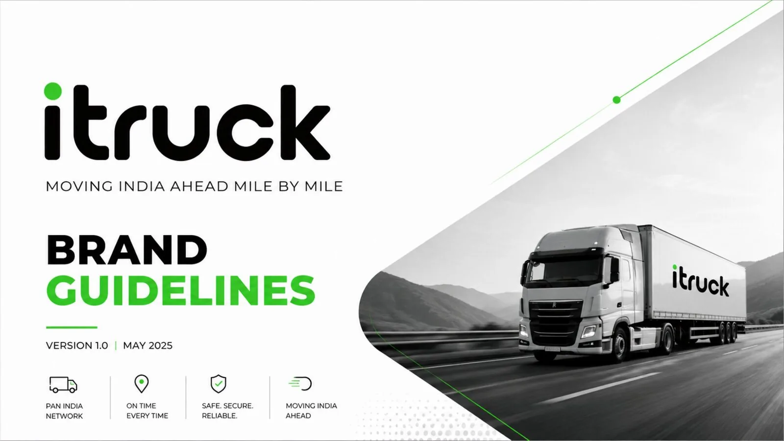
iTruck 🚛
A confident, modern identity for a pan-India logistics and fleet brand — built to feel reliable on the road and credible in the boardroom.
The brief.
iTruck needed a brand that could be read at speed on the side of a moving truck and still hold up in a partnership deck. We built a bold green-and-black identity with a distinctive dotted ‘i’ mark, then extended it across fleet livery, stationery and a clear, confident tone of voice.
A complete brand guideline system.
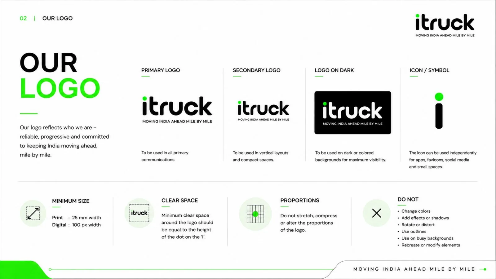
Logo & Icon System
A bold wordmark with a standalone dotted ‘i’ icon for app tiles, favicons and small-space use.
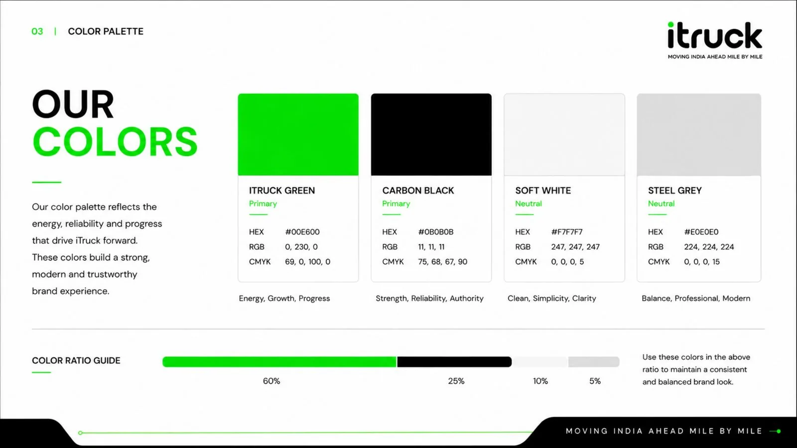
Colour & Typography
Poppins and Inter paired with a high-energy green-on-black system for strong on-road visibility.
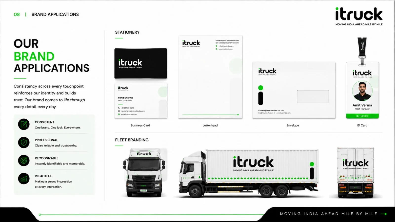
Fleet & Brand Applications
Stationery, ID cards and full fleet-vehicle livery in one consistent system.
Tone of Voice
Confident, reliable, forward-thinking messaging built around ‘Moving India Ahead.’
A closer look.
Spreads from the iTruck brand guideline document.
Want a brand system like this?
Let's talk about what a similar identity system could look like for your business.
Book a Strategy Call