


Premsukh Travel — Destination Management ✈️
A refined identity for a destination management company — built to sell curated, inspiring travel rather than discounted packages.
The brief.
As a B2B-leaning destination management company, Premsukh needed a brand that reads as considered and premium rather than transactional. We paired a teal-and-coral bird mark with an authentic, inspiring photography direction, and rewrote the brand's language so “cheap package” became “curated travel experience.”
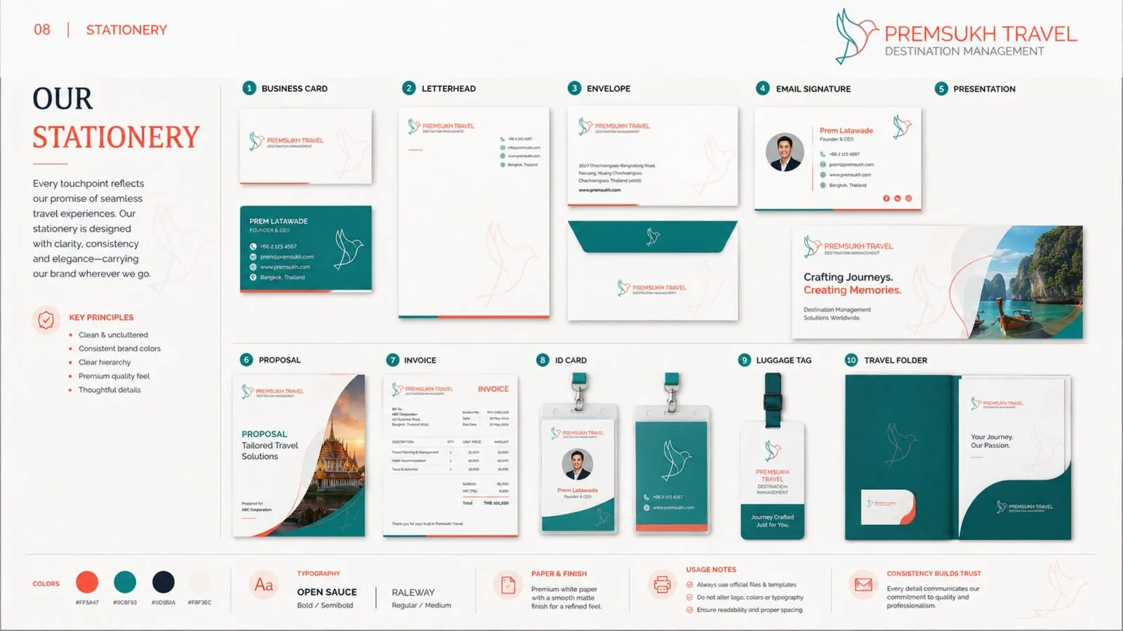
A complete brand guideline system.
Brandmark
A teal-and-coral bird-in-flight mark symbolising movement, trust and discovery.
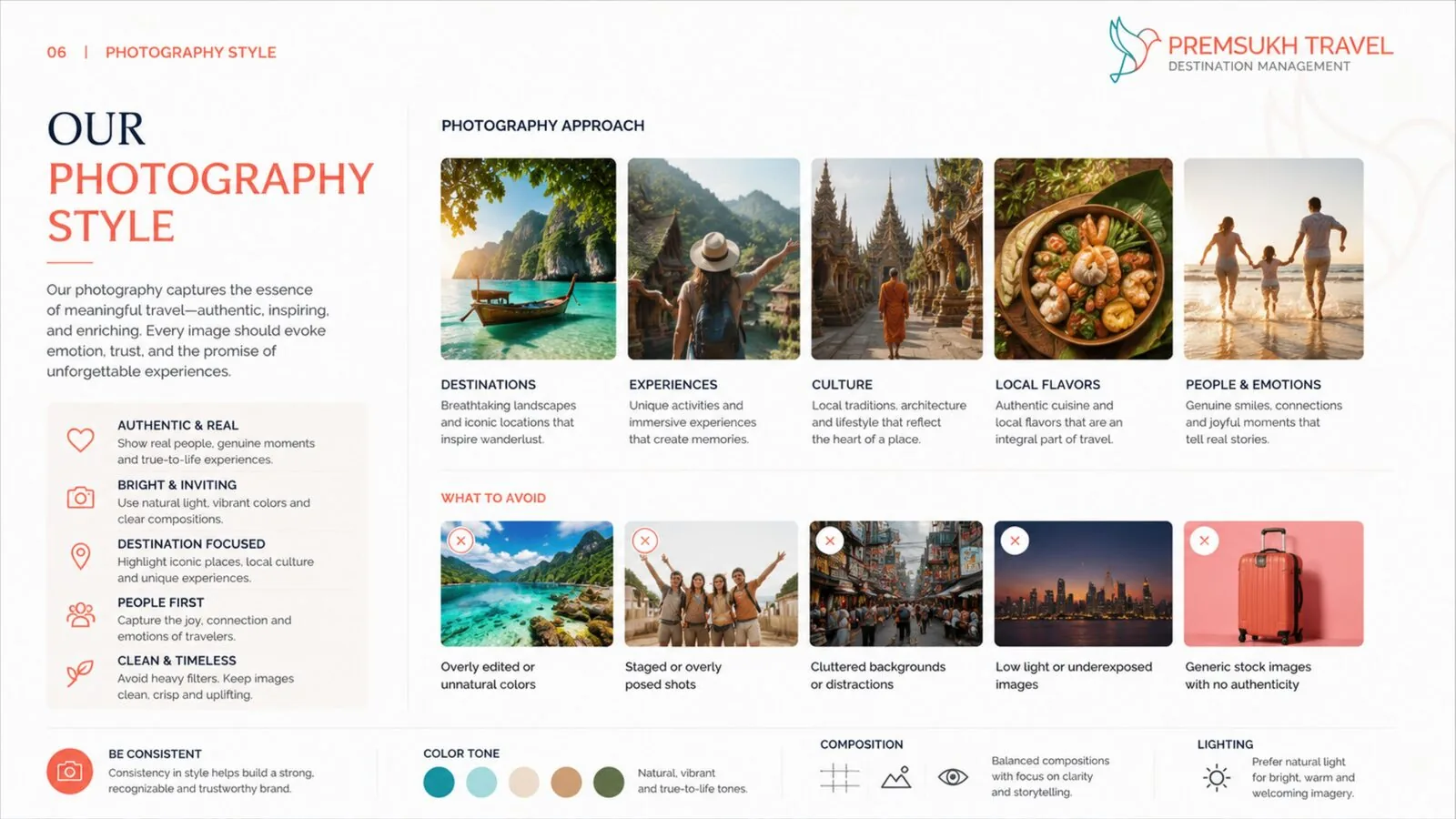
Photography Approach
An authentic, inspiring direction across destinations, culture, local flavours and people.
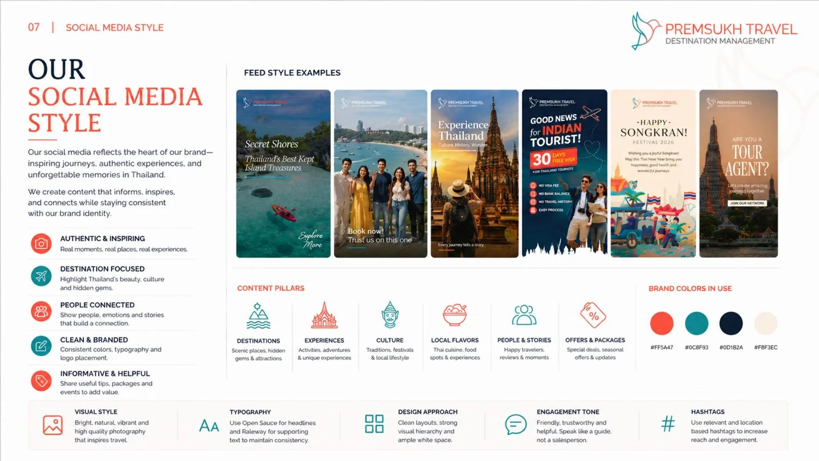
Social Media Style
Content pillars and feed styling built around destination storytelling.
Tone of Writing
A warm, inspiring rewrite guide — turning generic travel-agency language into considered, premium copy.
A closer look.
Spreads from the Premsukh Travel — Destination Management brand guideline document.
Want a brand system like this?
Let's talk about what a similar identity system could look like for your business.
Book a Strategy Call